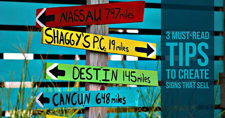
3 Must-Read Tips To Create Signs That Sell
Whether you’re creating a yard sale sign, a billboard or the sign outside your business, readability is key if you want your sign to help you sell. You can communicate a lot about your business through good design. We’ve all seen a billboard that was surprising or funny that we remembered and even told someone about. While that’s great, people sometimes get lost in over-designing to try and stand out and end upkeep in mind that effective signage is focused on clearly communicating a specific message. Think of it this way: every time someone sees your sign but doesn’t understand the message you’re trying to convey, it’s a lost potential sale. It sounds simple, yet all you have to do is drive through any business district and you’ll see tons of examples of bad signage. Here are three simple tips for creating better signs that sell:
1. Less is best. Keep your message short and direct, especially if it’s roadside. For billboards, I recommend seven words/elements or less. Your website, phone number, and logo would be included in that count. I’m not saying that I’ve never designed a billboard with eight elements, but if you keep this rule semi-sacred you won’t be tempted to put ‘everything but the kitchen sink’ on your billboard which would render it useless, at best, and possibly hazardous if drivers try to read all of that.
2. Higher contrast = more legible. When it comes to font and background color, choose a high contrast combo. I once saw a large roadside sign with a dark red background and black text. It was completely illegible and therefore a big, back-lit waste of money! White or very light backgrounds with dark letters are most universally easy to read. You can also reverse it, but dark backgrounds with light text can be harder to read, particularly for those with poor eyesight.
3. ‘Fancy’ isn’t better. I often hear people explain that they chose a particular font because it looked ‘fancier’ than the more ‘plain’ fonts they typically see. The problem with highly stylized fonts is that they can be difficult or near impossible to read up close, let alone from a passing car. This explains the prevalence of simple fonts. Use design to give your signs style without resorting to crazy fonts. If people can’t read it, what, if anything, are you communicating?
There you have it, three simple-yet-often-ignored tips for creating better business signage. Follow these and you’re in good shape.
Need help creating effective signage? Contact us today.
 Next Post